Circular
Purpose
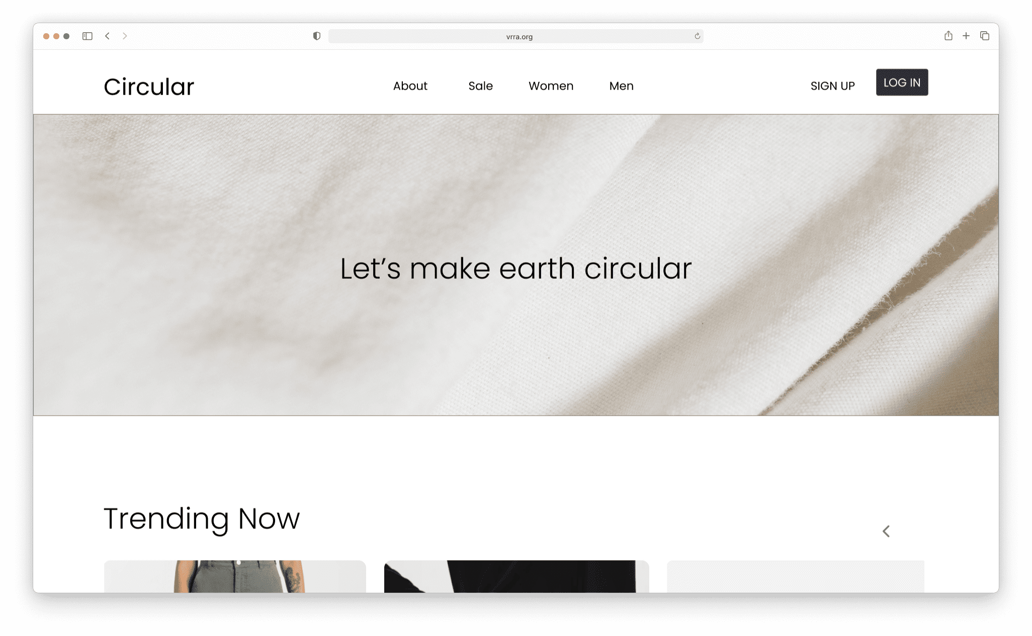
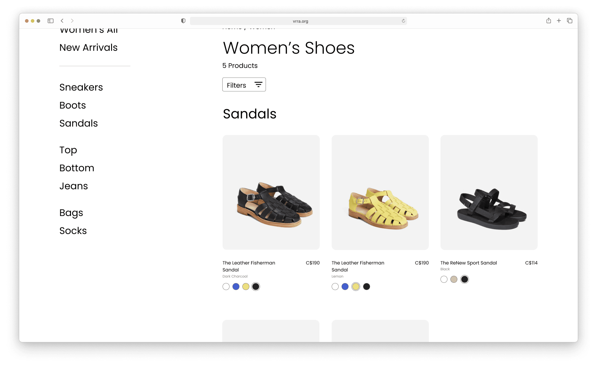
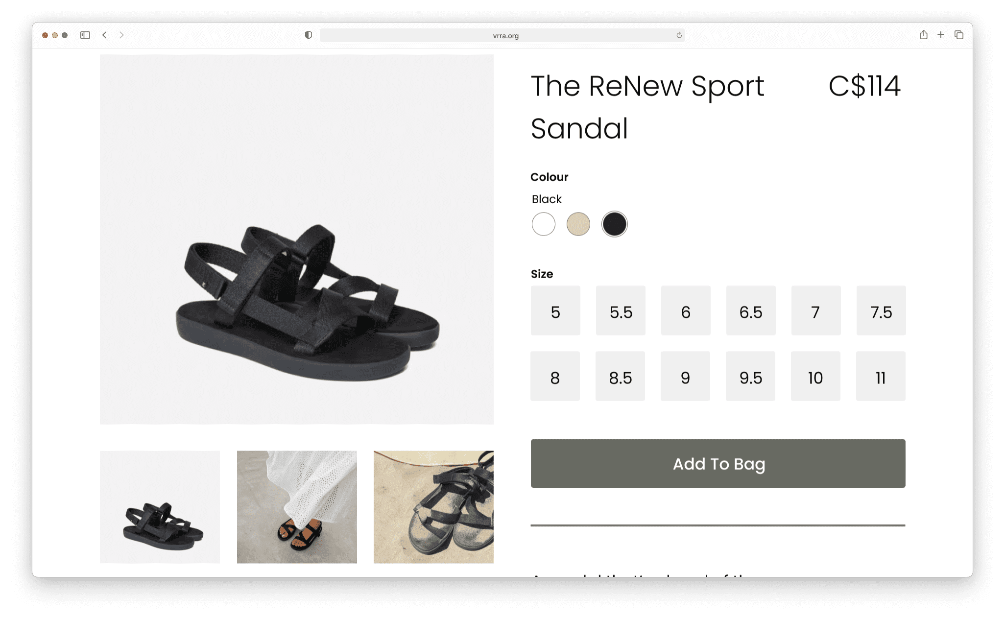
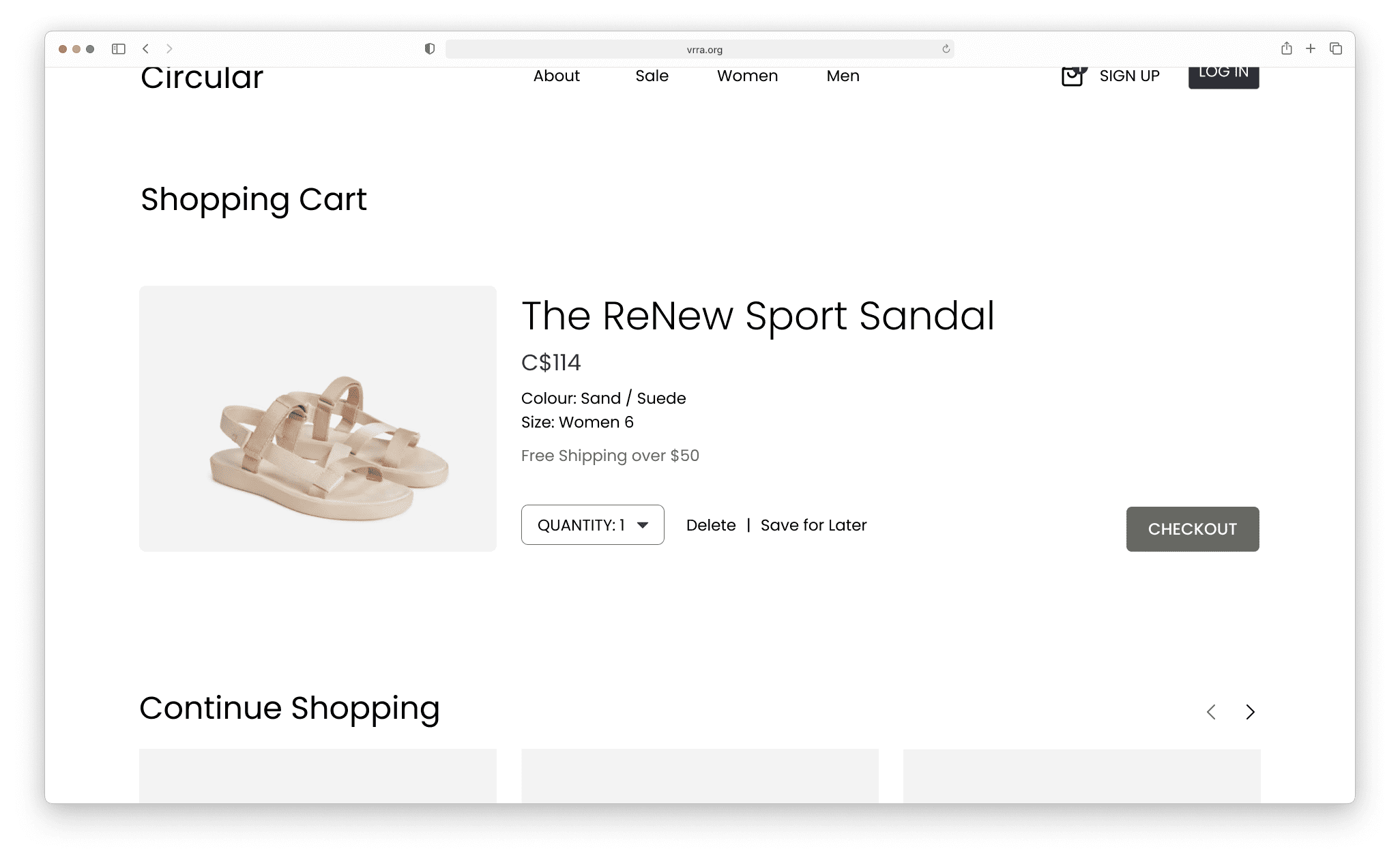
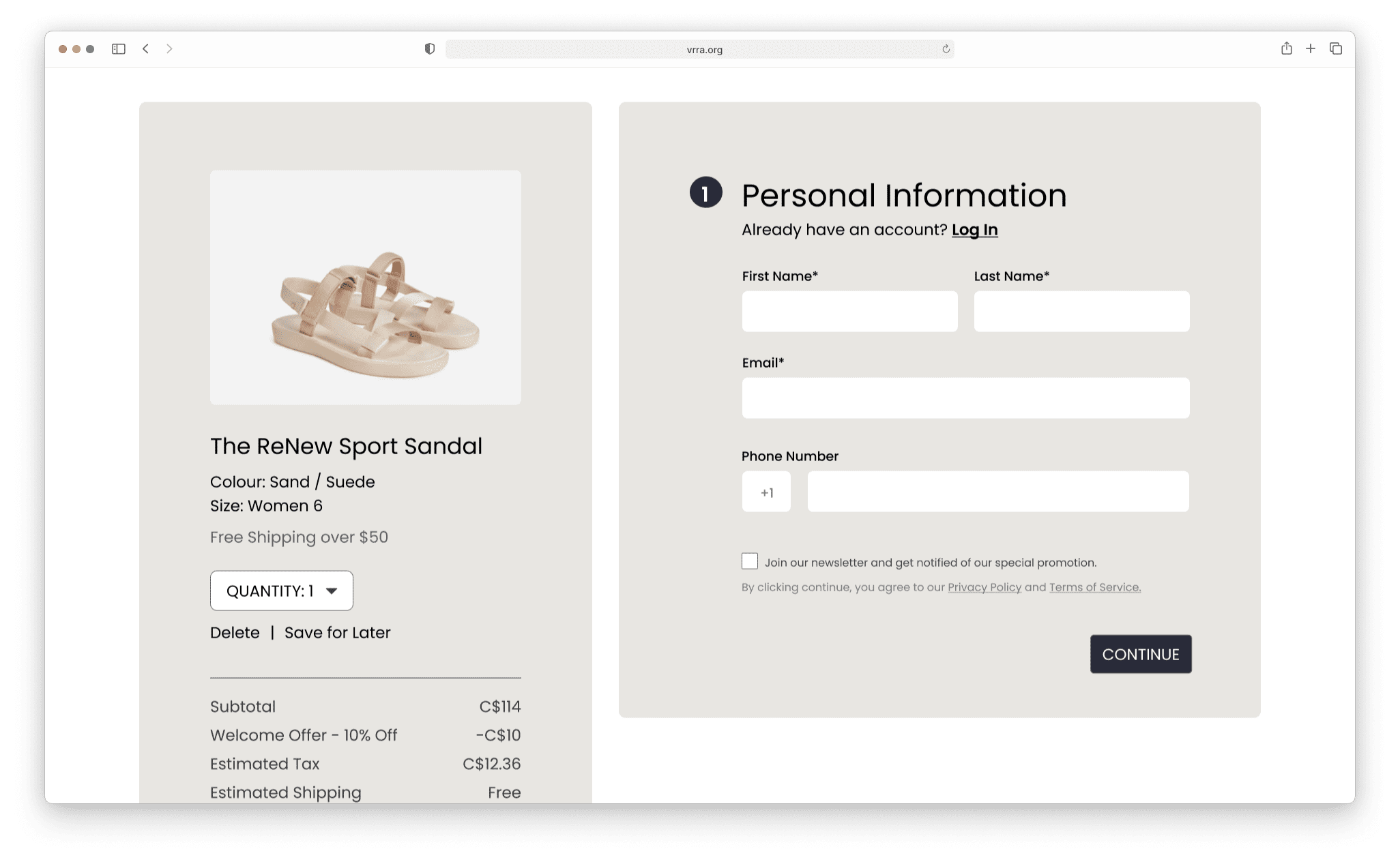
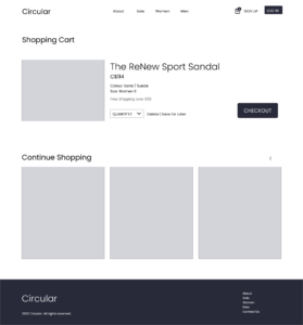
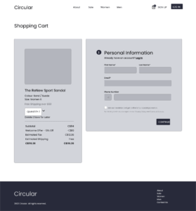
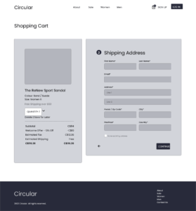
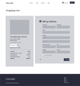
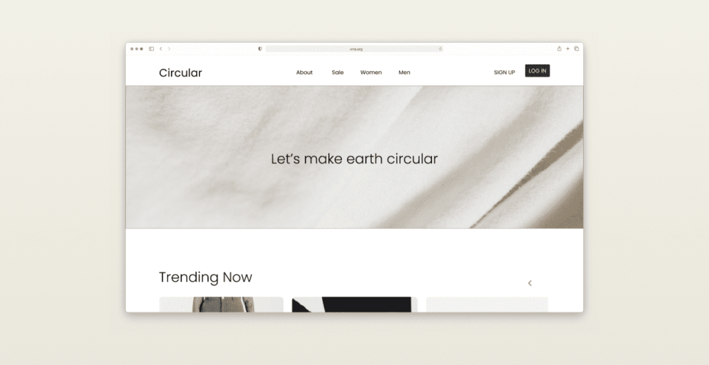
The goal was to investigate the user experience and analyze the gathered information to develop a prototype for an online clothing shop, employing skills from Adobe XD. The design specifically focuses on the checkout process for a selected item.
Date
May – June 2022
Role
UI/UX Designer
Tools
Adobe XD
Ideation & Low Fidelity Wireframes
Brainstorming
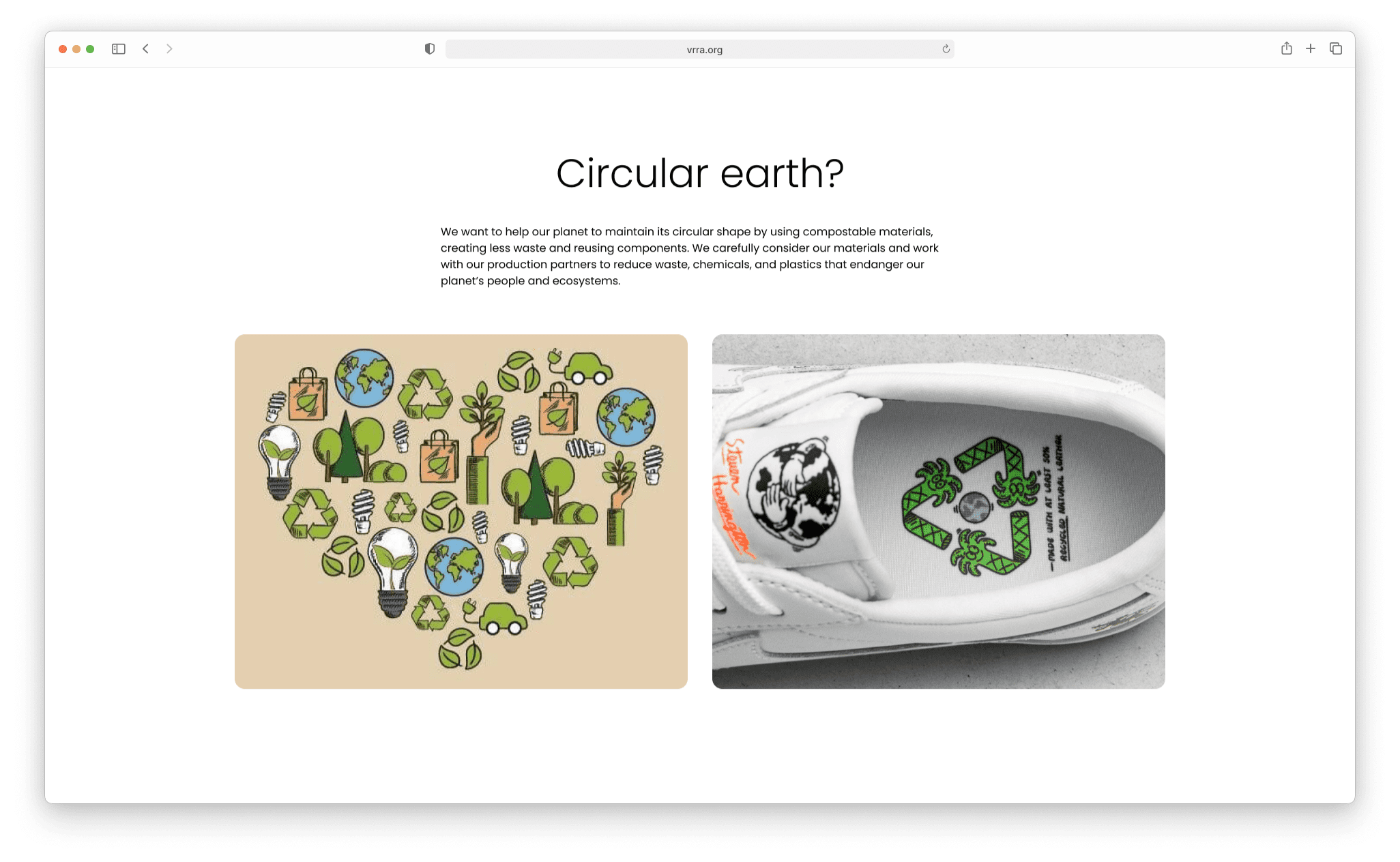
I aspired to create a clothing merchandise website where users could easily access information about sustainable materials and make purchases. My objective was to establish a straightforward and user-friendly process for both user sign-up and product checkout. The target audience for this website included individuals aged 16 to 40, with an interest in reducing waste and buying recycled products.
The ultimate goal for end-users was to stay informed about the company’s commitment to the eco-friendly movement and fulfill their need to purchase sustainable items.
Concept
The website aimed for a minimal, professional design to challenge stereotypes about sustainable products being low-quality.
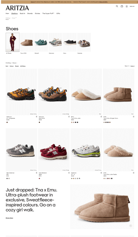
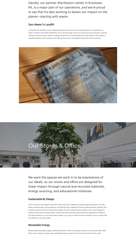
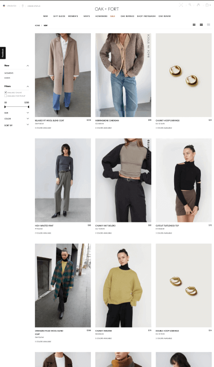
Drawing inspiration from brands like Oak and Fort, as well as Artizia, known for quality, I researched sustainable practices of companies like Nike and Everlane. This exploration offered insights into how brands engage with eco-friendly practices and communicate their commitment to customers.
User Research
Environmental awareness is a crucial social concern, particularly among younger generations such as Generation Z and Millennials. These individuals not only prioritize spending on daily products but also seek to align their consumption choices with social values, aspiring to contribute to a zero-waste lifestyle.
Low Fidelity Wireframes
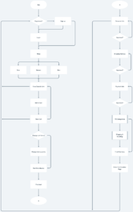
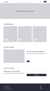
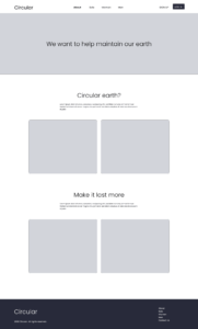
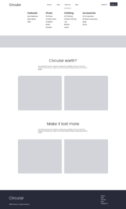
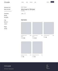
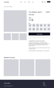
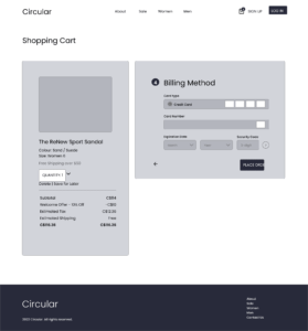
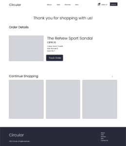
The challenge of creating wireframes was to have a valid user flow along with an appropriate design layout for users to be satisfied with their visit.
I thought about users’ interaction on the website such as which section they would be interested to see first in navigation, how much padding is needed for users to increase the readability, and the types of feedback they would expect as they navigate through the checkout process.
This problem was improved by searching various references in the research process and studying the common layout and padding sizes.
User Testing
User Testing
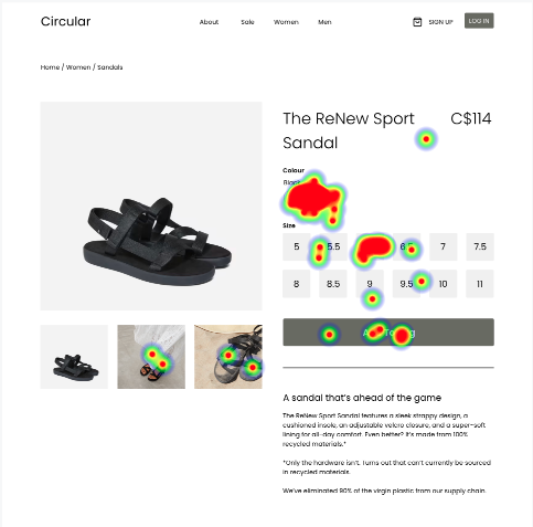
An unmoderated user testing session was carried out for the design, revealing no major issues critical to user interaction.
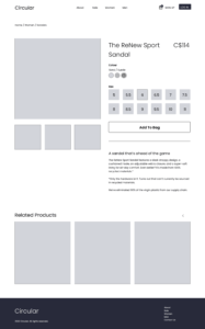
However, in the desktop version, testers encountered difficulty with button sizes due to their small dimensions and close spacing. To address this, I resolved the problem by enlarging the container size of the buttons and incorporating additional padding between each button.
Takeaways & Final Wireframes
Project Takeaways
In this project, I learned to conduct unmoderated user testing and analyze feedback. I explored different methods to make effective iterations for enhancing the user experience.
