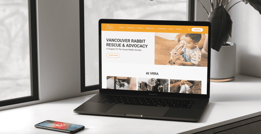
Vancouver Rabbit Rescue & Advocacy
Purpose
A school project, the purpose of which was to conduct a study of the user experience of a website. The project included the research of a potential website for redesign, the development and production of user research, and the analysis of data results with a possible design iteration.
The project was completed with four other members (Marlowe, Karla, Amanna & Michael). I participated in performing user testing and producing the UI/UX design of branding and high-fidelity wireframes.
Date
Oct 12, 2022 – November 13, 2022
Role
Test Moderator
UI/UX Designer
Tools
Figma – Wireframes
Google Forms – Screener Survery
Zoom – User Testing/Recording
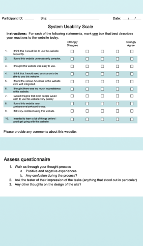
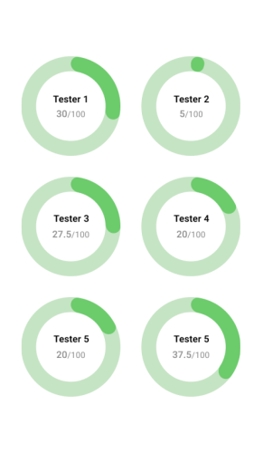
System Usability Scale – Data Analysis
Hypotheses & Testing
Hypotheses
- We believe that more rabbits will be adopted if potential adopters are able to successfully and efficiently browse rabbit listings with an improved information layout.
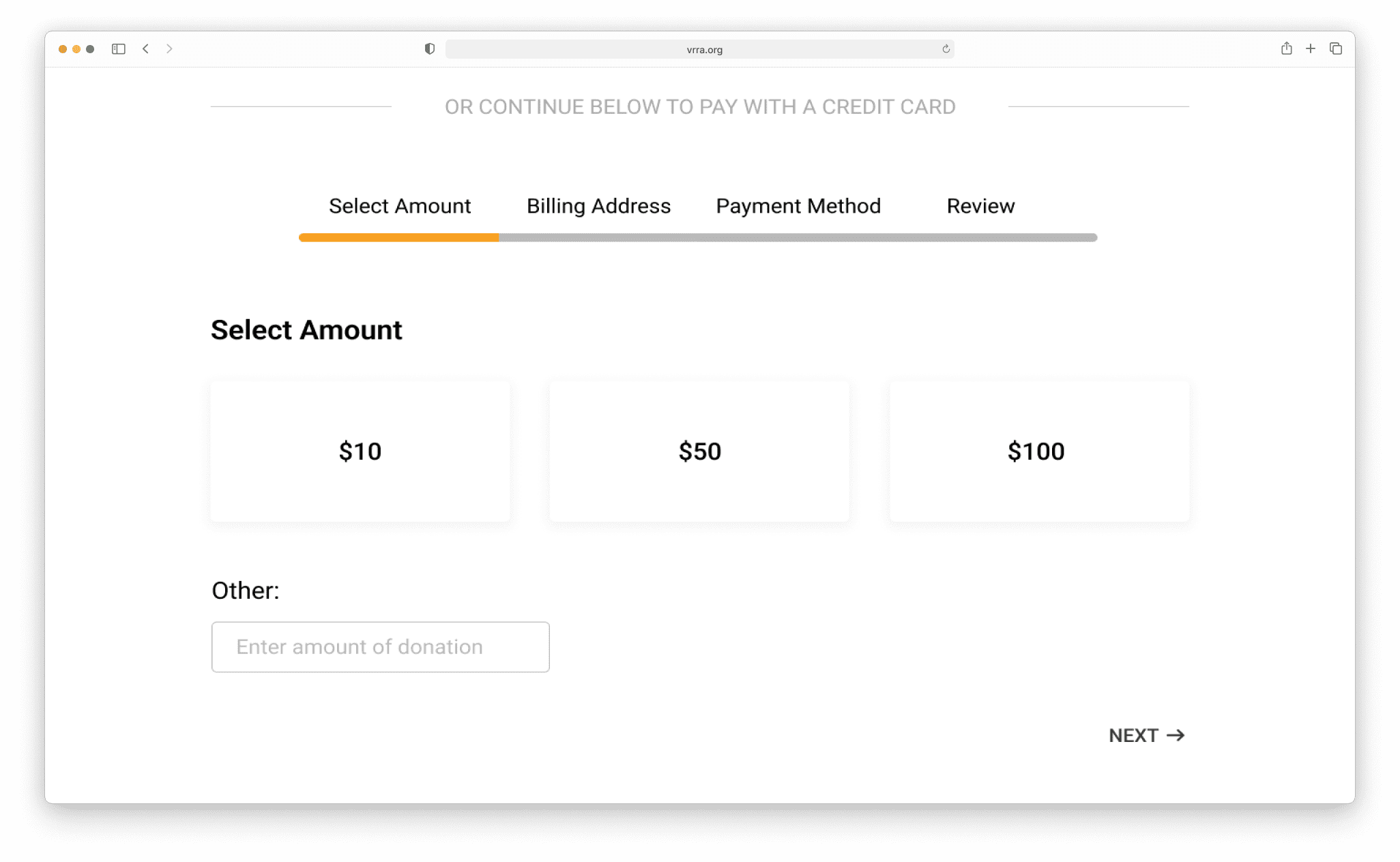
- We believe that increasing the donation amount will be achieved if potential donors are able to easily navigate through the donation process with a centralized donation page.
- We believe that users would have a better user experience on the website if the content of the website is organized in each category, and structured with a hierarchy.
Screener Testing
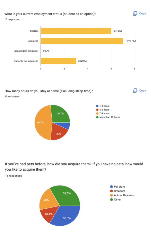
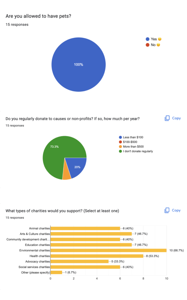
As individuals, group members generated 10-15 screener questions to narrow down suitable candidates for the project. These questions were specifically related to the candidate’s previous experience, interest in charity, and the physical environment in which they reside.
As a group, we consolidated our questions into a final set of 10 questions and utilized Google Forms to administer the questionnaires.
User Testing
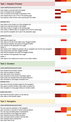
As a group, we chose 6 testers based on their ability to have pets in their residential space, prior experience with pets, and volunteer experience. Subsequently, we coordinated a moderated test through Zoom, with one member taking turns as the moderator for each tester. Two other members served as observers, recording oral and body behaviors of the testers using a Rainbow Spreadsheet.
Additionally, we administered three questionnaires to gain a deeper understanding of the thought process and impressions during the test
Data Analysis & Takeaways
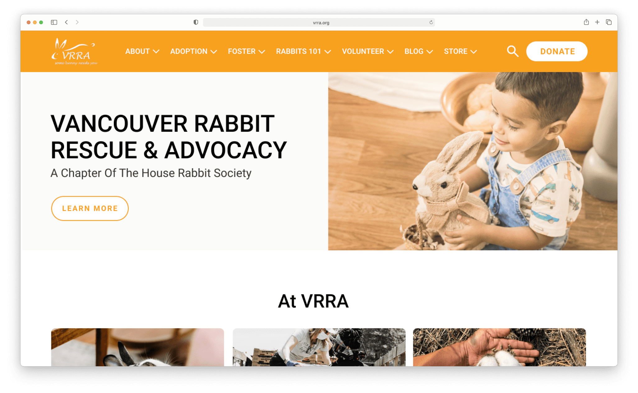
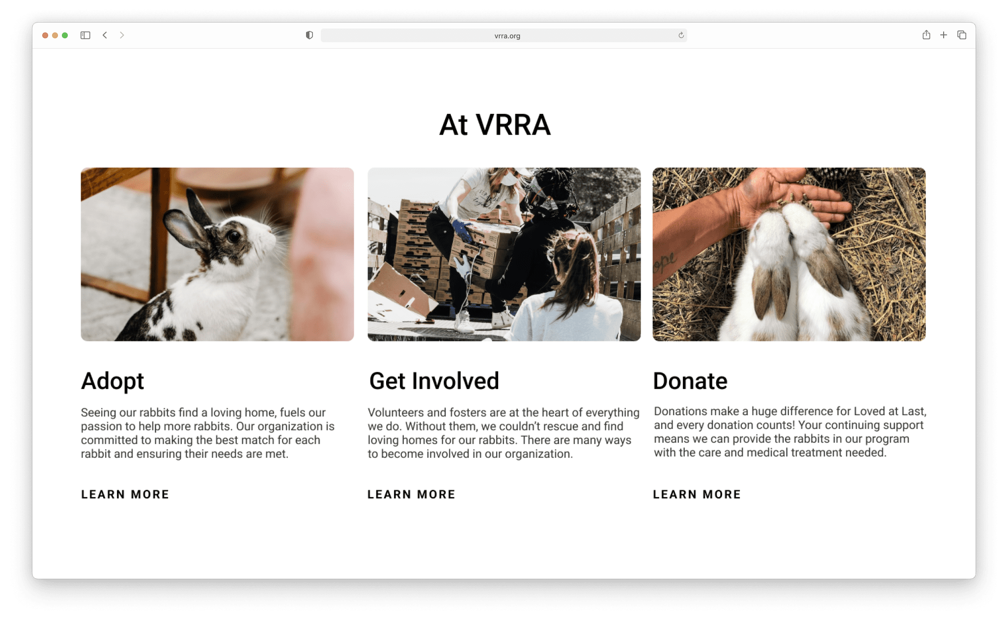
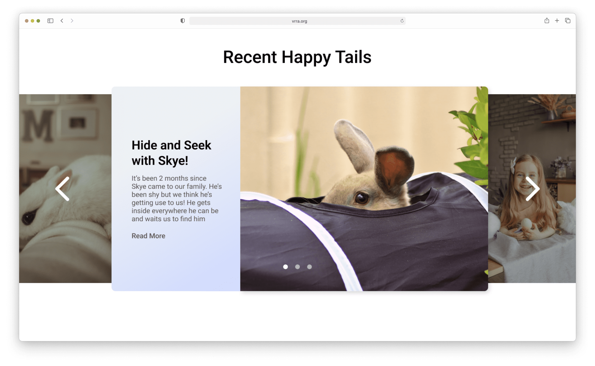
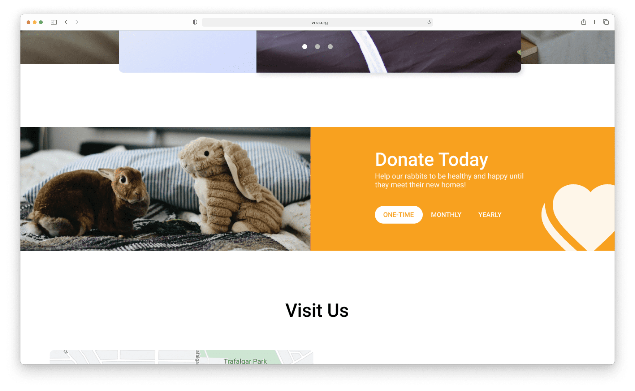
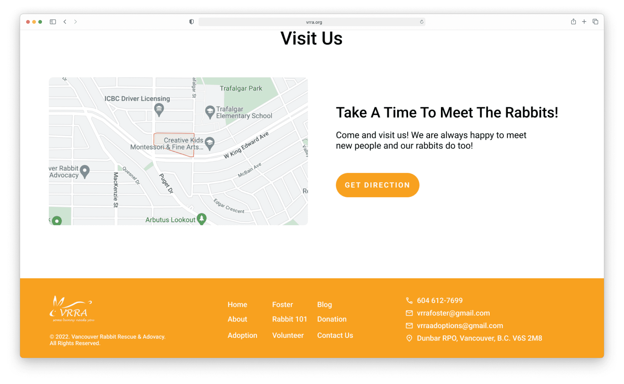
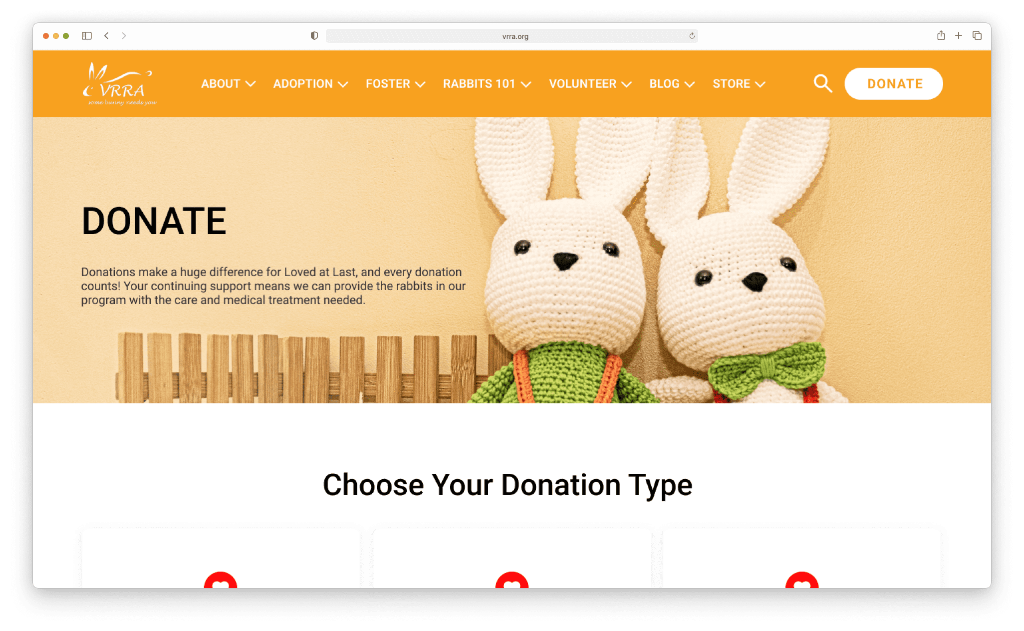
Vancouver Rabbit Rescue & Advocacy’s Original Website
Data Analysis
& Possible Improvement
After the data of user testing, 3 members analyzed the data using Rainbow Spreadsheet, System Usability Scale, and Assess Questionnaire. Marlowe and I established a new design according to the result of the testing.
Key Takeaways
- Inefficient navigation through the adoption process due to disorganized content and navigation.
- Difficulty in selecting the correct donation option caused by a lack of centralization.
- Confusion during the purchase process arising from a misleading explanation of the steps involved
Possible Improvements
- Enhance the layout for a more intuitive adoption process by refining categorization and hierarchy.
- Consolidate donation options into a single path, emphasizing a clear Call To Action.
- Introduce an e-commerce solution and redesign content using a card-style layout for improved clarity and user experience.
Project Takeaways
The primary takeaways I gleaned from this project involved identifying the website’s goal and implementing design strategies to reinforce that objective. The issue with the website lay in a confusing layout and overwhelming content, diminishing the emphasis on adoption and donation.
The prototype aimed to enhance user satisfaction by facilitating goal discovery and improving ease of use.
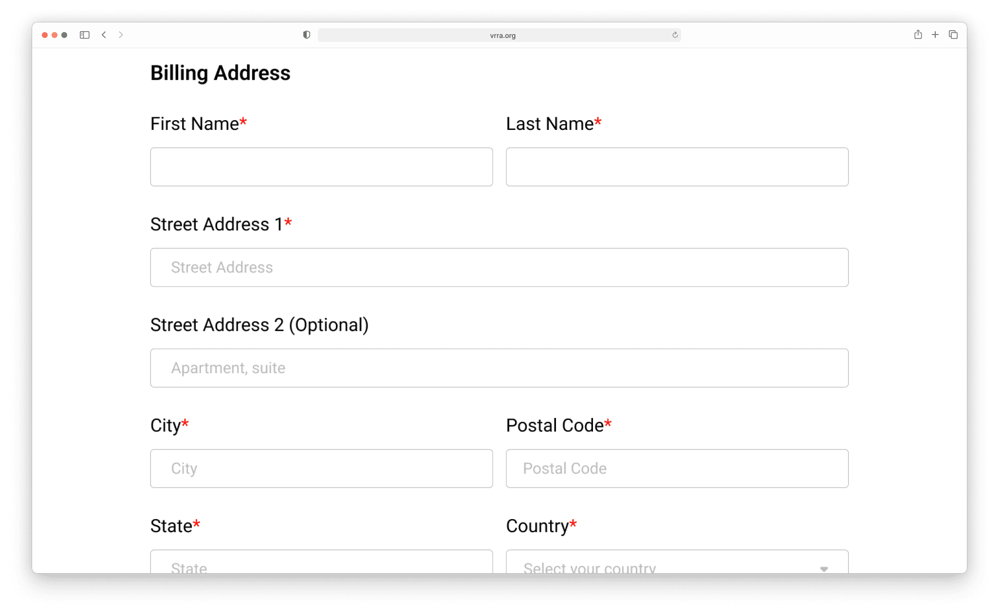
Final Wireframes
